The Ontario Open Government Initiative has opened up datasets on employment and training in the province. This article shows how to link data on new apprenticeships with data on layoffs to identify which industries are growing or shrinking. The trends become more clear if you can visualise the flows from layoff industries to apprenticeship industries. I’ll show how to do this by adding Path objects onto a stacked bar chart using Python and Matplotlib.
Background
The Open Toronto Open Data Book Club is an informal gathering of data scientists, where every month a new open dataset is chosen for analysis, and people bring along their results to a meetup at the end of the month. It’s really interesting to see what aspects of the dataset different people focus on!
The June 2017 meetup focuses on Employment Ontario data, available through the Ontario Open Government Initiative. Employment Ontario have published data for the year 2015-2016 on literacy and basic skills, employment services, second career training, and apprenticeships.
I decided to focus on the apprenticeships, to see which industries are growing. I wanted to compare this against industries that people were laid off from, available by looking at the data on people accessing employment services. The results show that industrial, electrical, construction, and maintenance trades are growth industries, while transport and healthcare assistance are not.
This article breaks down the Python 3 code to read the data, preprocess it into comparable formats, and generate a few different visualisations using Matplotlib. That link gives the full code in a Jupyter notebook, while this article skips over some of the details to focus on the interesting parts!
Reading the apprenticeships data
The apprenticeships data comes in two files: the data itself, which can be downloaded as a CSV file, and the Abbreviated Technical Dictionary (ATD), which is a PDF file describing each field. The ATD is linked at the bottom of the dataset description, and the data is linked on the top right of the page.
Each row of the CSV represents a different Local Board (essentially geographic region), and the columns are the data fields. Since the fields are different types (strings, integers, and floats), I used an ApprenticeRegion class to parse the data, which looks like this:
class ApprenticeRegion:
    def __init__(self, csv_row, header):
        self.header = header
        coltypes = [int, str, str, str, str, str, int, float] + 114*[int] + [float, float]

        self.data = []
        for i in range(len(csv_row)):
            val_str = csv_row[i]
            f = coltypes[i]
            try:
                self.data.append(f(val_str))
            except ValueError:
                na = 0 if f == int else 0.0
                self.data.append(na)
So reading the CSV, splitting off the header row, and creating ApprenticeRegions from each of the file rows looks like this:
directory = "/Users/vic/Projects/open-toronto/raw_data/employment_ontario/"

with open(directory+"Apprenticeship_Program_Data_by_Local_Board_Area_FY1516.csv") as f:
    reader = csv.reader(f)
    lines = [row for row in reader]

header = lines[0]
app_regions = [ApprenticeRegion(row, header) for row in lines[1:]]
Next, I extract out the regional board names into a list, which will be useful later:
boards = [r.column_by_name("SDS_Name") for r in app_regions]At this point I have the data to create a visualisation of the number of new apprenticeships in each region, and show which trades they apprenticed in. Since some regions are more population-dense than others, the absolute number of apprentices in each region varies quite a bit. Converting these numbers into percentages of the region total makes for a clearer comparison across regional boards.
Creating the plot
To make this graph, I added a method to the ApprenticeRegion class to convert an apprenticeships count field into a percentage, using the total number of new apprenticeships in the region (Num_New_Reg):
    def normalized_by_new(self, idx):
        j = self.header.index("Num_New_Reg")
        return self.data[idx]/self.data[j]
And the plot itself is generated as follows:
fig, ax = plt.subplots()
x_loc = range(len(boards)) # set up x-ticks
bottom = len(app_regions)*[0] # initialise the "bottom" of each bar segment
bars_for_legend = []
code_for_legend = []
# set up hatching patterns...
patterns = [ "/", "\\", "|", "-", "+", "x", "o", ".", "*", "//", "\\\\"]
pt = 0 # ...and point to the first one
for i in range(apps_start, len(header[:-2])):
# Extract the data for one specific trade from all regions
coldata = [r.normalized_by_new(i) for r in app_regions]
if sorted(coldata)[-1] == 0: # ignore if there are no apprentices in any region
continue
# Create the bar segments, stacked on the previous segments using bottom
bar = ax.bar(x_loc, coldata, bottom=bottom, hatch=patterns[pt])
bottom = [col+btm for col, btm in zip(coldata, bottom)] # update values
# Add colour, hatching, and trade code to the legend
bars_for_legend.append(bar[0])
code_for_legend.append(re.match(r'New_Reg_(\d\d\d\w)', header[i]).group(1))
if pt < len(patterns)-1:
pt += 1
else:
pt = 0
ax.set_xticks(x_loc)
ax.set_xticklabels(boards, rotation=90)
ax.set_yticks([0, 0.2, 0.4, 0.6, 0.8, 1.0])
ax.set_yticklabels(["0", "20", "40", "60", "80", "100"])
ax.set_ylabel("Percentage of new registrations")
plt.legend(tuple(bars_for_legend), tuple(code_for_legend), ncol=4, loc="upper left", bbox_to_anchor=(1,1))
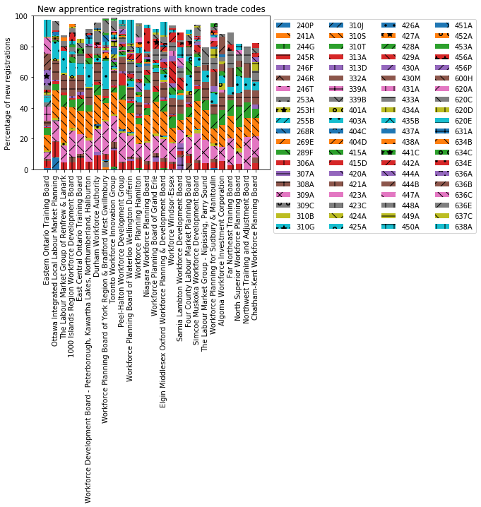
plt.title("New apprentice registrations with known trade codes")
plt.show()Analysis of the plot
The first thing that stands out about the plot is that the stacked bars don’t sum to 100%. Since the absolute numbers of apprenticeships in each trade were normalised against the total number of new registrations, this must mean that there were some new apprenticeship registrations that don’t have a specified trade code. Cell 44 of the Jupyter notebook investigates this further, but fundamentally there are some apprenticeships “missing” from the declared trade codes. Maybe some apprentices have registered, but not yet chosen a trade?
Anyway, the ultimate goal of this analysis is to compare layoff industries to apprenticeship industries, so it makes most sense to focus only on those with a declared trade. Therefore, the data should be renormalised against the number of declared trade apprenticeships, instead of the total number of new registrations by region.
Reading the layoffs data
Next, let’s look at the layoffs in the employment services data. This also comes in two files: a CSV file of the data, and a PDF of the Abbreviated Technical Dictionary. As before, each row of the CSV represents a different Local Board, and the columns are the data fields. I created a ServicesRegion class to parse this data:
class ServicesRegion:
    def __init__(self, csv_row, header):
        self.header = header
        coltypes = [int, str, str, str, str, str] + 112*[int] + [float, float]

        self.data = []
        for i in range(len(csv_row)):
            val_str = csv_row[i]
            f = coltypes[i]
            try:
                self.data.append(f(val_str))
            except ValueError:
                #print("Failed to convert", val_str, "to", str(f), "for", header[i])
                na = 0 if f == int else 0.0
                self.data.append(na)
And the file is read as follows:
with open(directory+"Employment_Services_Program_Data_by_Local_Board_Area_FY1516.csv") as f:
    reader = csv.reader(f)
    lines = [row for row in reader]

services_header = lines[0]
serv_regions = [ServicesRegion(row, services_header) for row in lines[1:]]
In contrast to the apprenticeships data, the employment services contains much more than just information about layoffs. Helpfully, the fields containing layoffs by occupation are contiguous, so we can find the start index and end index of the layoffs block as follows:
layoff_start = services_header.index("Layoff_Occ_12")
layoff_end = services_header.index("Layoff_Occ_84")
These can now be used for array slicing to extract just the layoffs from the full employment services data.
An aside about NOCs
The layoff fields indicate which occupation people were laid off from before they started accessing employment services. The two digits in the field name are the first two digits of the four digit National Occupation Classification (NOC) code. For example, “Layoff_Occ_12” counts how many service users were laid off from a job with NOC code 12XX, which covers administrative roles.
The NOC codes are not the same as the trade codes present in the apprenticeships data. We’ll revisit this later when aligning the two datasets.
Plotting layoffs by region
As with the apprenticeships data, I want to convert absolute layoff numbers into percentages, for ease of comparison across regions. Cell 50 of the notebook looks at consistency of the layoff data, and shows that the total number of layoffs does not equal the total number of employment services users. However this is more understandable here, as some service users will be entering the labour market for the first time, or returning to work, without having been laid off from any occupation.
Since I’m interested in industries, I’ll focus only on those who were laid off from a named occupation. To normalise these numbers so that they sum to 100% of layoffs, I first need to calculate the total number of layoffs in each region:
layoff_totals = len(serv_regions)*[0]
for i in range(layoff_start, layoff_end+1):
coldata = [r.data[i] for r in serv_regions]
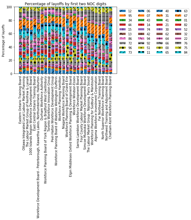
layoff_totals = [col+lt for col, lt in zip(coldata, layoff_totals)]Cell 51 of the notebook generates the plot, using layoff_totals to normalise the data. The code is very similar to that for the apprenticeships plot above, with the key difference being in looping through the NOC codes and calculating coldata:
for i in range(layoff_start, layoff_end+1):
    coldata = [serv_regions[j].data[i]/layoff_totals[j] for j in range(len(serv_regions))]

    ...
This produces the output shown below.
Analysis of the plot
By comparing the size of each bar segment across regions, it seems that broadly the same pattern of layoffs is seen across Ontario. There are some exceptions, such as Grand Erie showing particularly few 07 layoffs (orange forward slashes) and particularly high 96 layoffs (stars on yellow). These NOC codes correspond to “middle management occupations in trades, transportation, production and utilities” and “labourers in processing, manufacturing and utilities”, respectively.
On the whole, though, the regions look largely similar.
Aligning trade codes with NOC codes
Now we have apprenticeships data and layoffs data, but they still aren’t directly comparable. The apprenticeships areas are given by trade code, while the layoff industries are given by 2-digit NOC codes. In order to align these two datasets together, I need to map between trade codes and NOCs.
The NOC codes are broader in scope than the trade codes, since they include professionals and labourers as well as trades and craftspeople. Therefore it should be easier to map trade codes onto NOC codes than the other way around. Given that there are so many trade codes, we can also expect that multiple trades will map onto the same NOC.
To do this, I downloaded the List of apprenticable trades from the Ontario College of Trades. I extracted the data into a CSV file, where each row gives the NOC code, trade code, and name of each trade. I then created a Python dictionary of trade code to NOC, as follows:
with open(directory+"trades_nocs.csv") as f:
    reader = csv.reader(f)
    raw_trades = [row for row in reader]

trades_to_nocs = {}
for rt in raw_trades:
    trades_to_nocs["New_Reg_"+rt[1]] = rt[0] if rt[0] else "na"
Next, I have to regroup and count the apprenticeships by 2-digit NOC instead of trade code:
noc_totals = {}

for i in range(apps_start, len(header[:-2])):
    coldata = [r.data[i] for r in app_regions]
    noc = trades_to_nocs[header[i]] if header[i] in trades_to_nocs else "na"
    noc2 = noc[0:2] # take only the first two digits (to match layoff data)

    if noc2 in noc_totals:
        noc_totals[noc2] = [col+nt for col, nt in zip(coldata, noc_totals[noc2])]
    else:
        noc_totals[noc2] = coldata
Now with the apprenticeships counts in noc_totals, I can sum all apprentice registrations by region in order to convert absolute counts into percentages:
total_apprentices = len(app_regions)*[0]
for noc2 in noc_totals.keys():
    apps = noc_totals[noc2]
    total_apprentices = [a + ta for a, ta in zip(noc_totals[noc2], total_apprentices)]
And finally, I extracted the 2-digit NOC codes and occupation areas from the employment services ATD into another CSV, and made a Python dictionary of them:
with open(directory+"noc_to_area.csv") as f:
reader = csv.reader(f, delimiter="|")
raw_nocs = [row for row in reader]
noc_to_area = {}
for rn in raw_nocs:
noc_to_area[rn[0]] = rn[1]
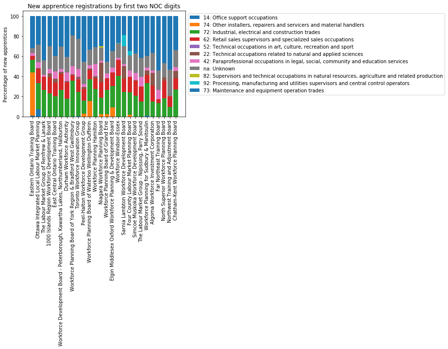
noc_to_area["na"] = "Unknown" # Some trade codes have no NOCFrom this, I can now generate a stacked bar chart of the apprenticeships where each bar segment is a NOC code (where previously it was a trade code). The main difference in the code is the iteration and extraction of bar segment data into coldata:
for noc2 in noc_totals.keys():
    coldata = [nt/ta for nt, ta in zip(noc_totals[noc2], total_apprentices)]

    ...
And the output looks like this!
Comparing layoff industries to apprenticeship industries
The final stage of this analysis is to find industries which are growing or shrinking, by comparing the NOC codes for layoffs and apprenticeships. At this point I’ll combine all the regions into one dataset for Ontario, as the patterns across regions are broadly similar. Cell 52 of the notebook does this, by summing all apprenticeships and layoffs included in the charts above, and renormalizing so that the totals of each still sum to 100%.
In addition, I want the NOC codes to appear in the legend in numerical order (you can see in the plots above they are somewhat random). I order them by:
- Extracting the layoff NOC codes from the CSV field names
- Combining them with the apprenticeship NOC codes from
noc_totals - Converting the combined list to a set to remove duplicates
- Convert back to a list, and sort them.
lay_nocs = [re.match(r'Layoff_Occ_(\d\d)', services_header[i]).group(1) for i in range(layoff_start, layoff_end+1)]
app_nocs = list(noc_totals.keys())
ordered_nocs = sorted(list(set(lay_nocs+app_nocs)))
Plotting the flows
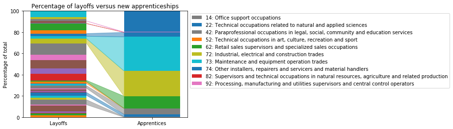
Finally, we’re ready to generate a visualisation of layoff versus apprenticeship industries!
Cell 54 of the notebook contains the code for this plot, but I’m going to break it down step by step here.
Essentially, this plot is another stacked barchart, so a lot of the code is similar to before. The main difference is that we no longer have a list of regional boards on the x-axis, but instead one single location at which we’re plotting two bars side by side. Each bar is now a partial bar width wide.
First, there is some setup of parameters for this chart:
fig, ax = plt.subplots()
x_loc = np.arange(1)
lay_bottom = [0]
app_bottom = [0]
bars_for_legend = []
code_for_legend = []
width = 0.6
Next, we need to iterate through each 2-digit NOC code to find the next segment for the layoffs bar and for the apprenticeships bar:
for i in range(len(ordered_nocs)):
    noc2 = ordered_nocs[i]
    lay = layoffs_normalized[i]
    app = apps_normalized[i]
With this data, we can plot the first bar’s segment. We then need to inspect it to find its colour, and manually set the colour of the second bar’s segment to be the same. Then, update the bottom markers so the next segments will be positioned correctly:
    bar1 = ax.bar(x_loc, [lay], bottom=lay_bottom, width=width)
    color = bar1[0].get_facecolor()
    bar2 = ax.bar(x_loc+1, [app], bottom=app_bottom, width=width, color=color)
    lay_bottom = [lay+lay_bottom[0]]
    app_bottom = [app+app_bottom[0]]
Next, if a non-zero segment exists for this NOC code in both bars, draw a flow between them. This is achieved by drawing a Path polygon, from the top right corner of bar 1, to the top left corner of bar 2, to the bottom left corner of bar 2, to the bottom right corner of bar 1, using the same colour as the bars:
    if lay != 0 and app != 0:
        b1_tr = (x_loc[0] + width/2, lay_bottom[0])
        b1_br = (x_loc[0] + width/2, lay_bottom[0]-lay)
        b2_tl = (x_loc[0]+1 - width/2, app_bottom[0])
        b2_bl = (x_loc[0]+1 - width/2, app_bottom[0]-app)

        path_codes = [mpath.Path.MOVETO, mpath.Path.LINETO, mpath.Path.LINETO, mpath.Path.LINETO, mpath.Path.CLOSEPOLY]
        path_verts = [b1_tr, b2_tl, b2_bl, b1_br, b1_tr]
        path = mpath.Path(path_verts, path_codes)
        patch = mpatches.PathPatch(path, facecolor=color, edgecolor=color, alpha=0.5)
        ax.add_patch(patch)
And only if a flow exists, add this NOC code to the legend:
        noc_title = noc_to_area[noc2] if noc2 in noc_to_area else "Unknown"
        bars_for_legend.append(bar1[0])
        code_for_legend.append(noc2 + ": " + noc_title)
Finally, manually set the x-ticks and labels, the y-ticks and labels, and set up the legend:
ax.set_xticks([0, 1])
ax.set_xticklabels(["Layoffs", "Apprentices"])
ax.set_yticks([0, 0.2, 0.4, 0.6, 0.8, 1.0])
ax.set_yticklabels(["0", "20", "40", "60", "80", "100"])
ax.set_ylabel("Percentage of total")

plt.legend(tuple(bars_for_legend), tuple(code_for_legend), loc="upper left", bbox_to_anchor=(1,1))
plt.title("Percentage of layoffs versus new apprenticeships")
plt.show()
This gives the comparative plot!
Analysis of results for employment in Ontario
So what does this tell us? The first point that stands out to me is that 80% of apprenticeships are in areas where there already were workers (a flow exists from the layoffs to the apprenticeship areas). In all but one of these areas, more apprenticeships have started than people were laid off, suggesting these industries are growing. The exception is office support occupations, where the percentage of apprenticeships looks smaller than the percentage of layoffs.
Secondly, there are a lot of layoff industries with no new apprenticeships (a segment appears in the layoffs bar, but there is no flow to apprenticeships). As mentioned before, some of these layoffs will be from professional or labourer NOC codes, where there is less scope for an apprenticeship. However, it doesn’t look like good news for those that are laid off if their industry isn’t taking on new people. It might indicate a need for retraining or switching to a different sector.
Conclusion
This is really just a first few steps in the analysis of this data. In the article I have shown how to align data for apprenticeships and layoffs onto the same NOC codes, and how to generate visualisations using Matplotlib. In order to see the flows from layoff areas to apprenticeship areas I had to go beyond the standard charts in Matplotlib, and demonstrate how to add polygons to your plots using Path objects.
If this has given you some ideas of further visualisations to explore, take a look at the full code on GitHub and explore your own region!