Data scientists don’t just analyse raw data. We extract and design useful features which let us model the underlying system. Features are a compact way of describing important patterns in the data.
Previously, I showed how to begin analysis on a new problem by reading in and plotting some open data, and calculating a simple feature vector. Here, I build on this by assessing the three key types of features.
Why calculate features?
The goal of feature extraction is to draw out important information, in order to simplify pattern recognition. Humans are very good at looking at graphs and spotting clusters, patterns, and outliers, but training a software system to do the same can be much harder. In particular, coincidental links between parameters will distract from the intended pattern, and the more data there is, the more likely these spurious links will occur. Calculating features will reduce the sheer number of data points, letting the software focus on the right pattern.
However, there still needs to be enough data to usefully distinguish between patterns. If we take a person’s temperature (a single feature) and it looks a little high, it’s difficult to tell whether they are ill or have just been exercising. Instead, we need other features to provide context, to separate out healthy and unhealthy states.
A good approach is to calculate a reasonably large feature set for some data. It’s hard to tell beforehand which features will reveal the most interesting patterns, so the more we can think to test, the better. If it gets to be too many, visualisation and statistical methods can be used to identify the best subset later.
Types of features
Thinking of features to generate can be a challenge itself, but there are three broad categories to consider:
- Domain-specific features, where you use some knowledge about the problem to identify likely points of interest in the data,
- Statistical features, which require no knowledge of the domain, but characterise the data purely based on properties such as mean, median, and standard deviation,
- Visually derived features, where you see some pattern in the data and develop a method to capture it.
For the bearing dataset from University of Cincinnati, I’ll explore each of these types of feature in turn. To get started, follow the previous article or use this snippet to read in the first file of data:
basedir <- "/Users/vic/Projects/bearings/bearing_IMS/1st_test/"
data <- read.table(paste0(basedir, "2003.10.22.12.06.24"), header=FALSE, sep="\t")
colnames(data) <- c("b1.x", "b1.y", "b2.x", "b2.y", "b3.x", "b3.y", "b4.x", "b4.y")
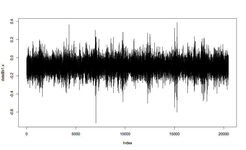
plot(data$b1.x, t="l")This generates a plot of bearing 1’s x-axis vibration, which should look like this:
Domain-specific features
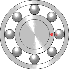
Bearings are very widely used in mechanical systems, so there is a lot of engineering experience with interpreting bearing vibration patterns. Particular types of bearing failure will affect the vibration profile in different ways. There are four key frequencies that are recommended for monitoring, called the ball pass outer race (BPFO), ball pass inner race (BPFI), ball spin frequency (BSF), and fundamental train frequency (FTF).
If there is a problem such as a crack on one of the balls within the bearing (more properly called a rolling element), it will reduce the smoothness of rotation by hitting or bouncing as it comes into contact with neighbouring components. This will generate increased vibration at the ball spin frequency (BSF), since once per rotation the crack will come back into contact with the neighbour. Alternatively, if the crack is in the inner race (the rotating inner casing, which the light red dot is travelling around), it will increase vibration at the BPFI, since this is the frequency at which rolling elements come into contact with that point on the inner race. Similarly, the BPFO relates to balls passing the outer race, the fixed casing which surrounds and contains the rolling elements. More explanation of the four key frequencies is given by the Mobius Institute.
To calculate these four frequencies for the dataset bearings, we need some specific information about the structure and size of the bearing components. This can be found in a paper published by the team who ran the experiment, and reproduced below. We also need the equations for calculating BPFO, BPFI, BSF, and FTF, which are widely available online. The R code for the calculations is:
Bd <- 0.331 # ball diameter, in inches
Pd <- 2.815 # pitch diameter, in inches
Nb <- 16 # number of rolling elements
a <- 15.17*pi/180 # contact angle, in radians
s <- 2000/60 # rotational frequency, in Hz

ratio <- Bd/Pd * cos(a)
ftf <- s/2 * (1 - ratio)
bpfi <- Nb/2 * s * (1 + ratio)
bpfo <- Nb/2 * s * (1 - ratio)
bsf <- Pd/Bd * s/2 * (1 - ratio**2)
Which gives the values:
            ftf     bpfi     bpfo      bsf
  [1,] 14.77522 296.9299 236.4035 139.9167
I’ll use a similar function to the last article to calculate the FFT, but this time return the full FFT spectrum:
fft.spectrum <- function (d)
{
	fft.data <- fft(d)
	# Ignore the 2nd half, which are complex conjugates of the 1st half,
	# and calculate the Mod (magnitude of each complex number)
	return (Mod(fft.data[1:(length(fft.data)/2)]))
}
The output of the FFT has the half the number of frequency buckets as the number of input points, and the frequency range covered is from 0Hz to half the sampling frequency (called the Nyquist frequency). For the bearing dataset, the number of data points is not exactly the same as the frequency range, and so a frequency bin does not correspond to a whole Hertz. Specifically, there are 20,480 data points per file, which is halved to get the number of frequency bins (10,240). But the sampling frequency of the data is 20kHz, which gives a Nyquist frequency of 10kHz.
In practical terms, this means that every frequency bin is 10,000/10,240 = 0.9766Hz. To simplify the conversion from frequency in Hertz to bin number (index number into the FFT spectrum array), I’ll use a helper function:
freq2index <- function(freq)
{
	step <- 10000/10240 # 10kHz over 10240 bins
	return (floor(freq/step))
}
Now I can put these two functions together with the key bearing frequencies (in Hertz) calculated earlier, to generate the first four features.
fft.amps <- fft.spectrum(data$b1.x)
features <- c(fft.amps[freq2index(ftf)],
              fft.amps[freq2index(bpfi)],
              fft.amps[freq2index(bpfo)],
              fft.amps[freq2index(bsf)])
For the first bearing data file, this gives the following features:
[1] 10.474550 6.952257 6.448870 25.312705
In addition to key frequencies, engineers are often concerned with the root mean squared (RMS) value of a sinusoidal signal. When the signal contains both positive and negative values, the RMS can be more informative than a mean value, which often comes out around zero.
The RMS can be thought of as a statistical measure, but since it is an engineer’s preferred averaging technique, I’ll count it as a domain knowledge feature. It can be calculated and appended to the feature list like this:
features <- append(features, sqrt(mean(data$b1.x**2)))Statistical features
Without knowing anything about the data or domain, there are standard statistical features which can characterise the shape of the data. Broadly speaking, these features can tell you how closely the data matches a Normal distribution (bell curve).
The first two are the mean and standard deviation (or variance) of the data. The next is the skewness, which tells you whether the majority of the datapoints are greater or less than the mean value. Another is kurtosis, or how peaked or flat a curve the data fits to.
Next up are quantiles, where the data is separated into four equally sized sets. The boundary values of the sets form five features. The minimum and maximum values in the dataset are always the first and last features, while the median of the dataset is always the third feature. The second and fourth can be thought of as the medians of the lower half (data between the minimum and median points) and the upper half (between the median and the maximum) of the dataset.
The R code to calculate these features is quite short and neat, but the skewness and kurtosis require the e1071 library:
library(e1071)
features <- append(features,
                   c(quantile(data$b1.x, names=FALSE),
                     mean(data$b1.x),
                     sd(data$b1.x),
                     skewness(data$b1.x),
                     kurtosis(data$b1.x)))
Visually derived features
The starting point for data science is always to visualise the data, which involves creating lots of plots and looking for patterns. Sometimes I’ll see a pattern which seems to correspond to the underlying thing I’m looking for, which in this case is bearing failure. If I’m really lucky, this will be something simple like a variable increasing around the time of a known failure. More likely, it will be some sort of shape or change which can be quite hard to describe, but feels promising.
For the last article, the features chosen were the frequencies of the strongest five vibration components, as calculated by FFT. In particular, the second strongest component looked promising as a feature, since bearings 3 and 4 (which failed) looked different from bearings 1 and 2, and these differences only became apparent during the final half of the experiment. Without knowing exactly when the failures started, I have to rely on hints like this, and so I’ll add these features to the overall set.
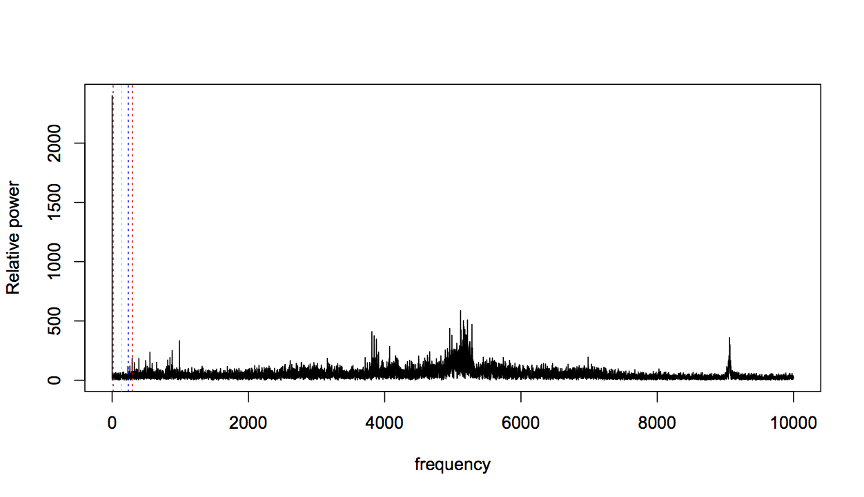
For the final group of features, I again looked at some plots and used a bit of intuition. I noticed that the domain-specific bearing frequencies (shown with dashed lines below) were often not the highest spikes in the FFT profile:
frequency <- seq(0, 10000, length.out=length(data$b1.x)/2)
plot(fft.amps[1:(length(data$b1.x)/2)] ~ frequency, t="l", ylab="Relative power")
abline(v=bsf,col="green",lty=3)
abline(v=bpfo,col="blue",lty=3)
abline(v=bpfi,col="red",lty=3)
abline(v=ftf,col="brown",lty=3)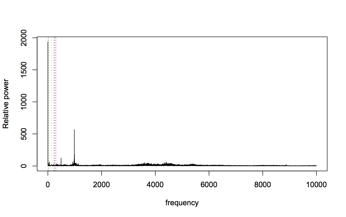
Zooming in to frequencies between 0 and 1000Hz makes this even clearer:
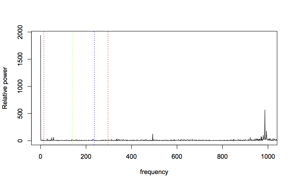
For data taken near the start of the experiment, this is not very surprising: a fresh bearing shouldn’t generate fault-related vibration frequencies. So let’s consider bearing 3, which was known to fail with an inner race fault, and should therefore strongly affect the BPFI frequency. Here’s the FFT for bearing 3, two files before failure (BPFI is the right-most line in red):
Zooming in again:
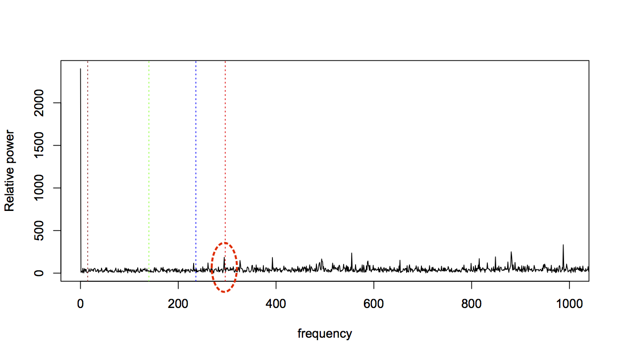
The BPFI has clearly increased, but it’s only one change amongst many. The profile as a whole looks very different from the fresh bearing profile, with many areas dense with spikes that were previously much more flat. This change in profile seems relevant, so I want to capture it in a feature.
However, it’s not immediately obvious how to describe this change. There are more spikes, but what counts as a spike is relative to the rest of the profile, not an absolute threshold. It could be said to look more “bushy”, but while this might explain things to a human, I have to get to the bottom of what bushiness means if I’m going to calculate a feature for it.
Returning to an engineering understanding of the data, this change represents much higher levels of vibration than earlier traces. The clusters of frequencies have all increased together, because the wear and debris in the faulty bearing is causing more vibration across the spectrum. In engineering terms, it can be described as increased signal power in various bands of frequencies.
Therefore, it leads me to think the frequency spectrum should be split into bands, and the power of all the components within those bands calculated. I can use a mixture of engineering judgement and data visualisation to choose boundaries on these bands.
The Mobius Institute identifies very high frequency as being between 5kHz and 40kHz, high frequency between 1kHz and 5kHz, and mid/low frequency as being under 1kHz. Looking at both the early and late FFT spectra above, 5kHz is right in the middle of a cluster of spikes, and is therefore not a good choice. Slightly higher at 6kHz seems a better boundary, particularly since the later profile shows clusters of spikes higher than this. Similarly, 1kHz is not a good boundary cut-off, since one of the highest spikes in the early profile falls around here. Setting it slightly higher at 1.25kHz captures this spike well within the low frequency band.
However, 1.25kHz to 6kHz is a relatively wide band. While these two profiles show clusters of spikes between the middle and top of this band, some of the other bearing profiles show clusters towards the bottom of the band. Therefore, I’ll split this part of the spectrum into two, with a boundary at 2.6kHz. This gives a total of four bands, which I’ll call very high frequency (VHF), high frequency (HF), mid frequency (MF), and low frequency (LF).
With the boundaries decided, all that remains is to calculate the power in these bands. A nice feature of the FFT is that the amplitude of each spike is the power in that frequency bin, so the total power in a band is the sum of all the spike amplitudes. This is calculated as follows:
# Frequency bands
vhf <- freq2index(6000):length(fft.amps)    # 6kHz plus
hf <- freq2index(2600):(freq2index(6000)-1) # 2.6kHz to 6kHz
mf <- freq2index(1250):(freq2index(2600)-1) # 1.25kHz to 2.6kHz
lf <- 0:(freq2index(1250)-1)                # forcing frequency band

powers <- c(sum(fft.amps[vhf]), sum(fft.amps[hf]), sum(fft.amps[mf]), sum(fft.amps[lf]))
features <- append(features, powers)
Results
The full code for calculating this feature vector for every file in the bearing dataset can be downloaded from GitHub. The next step is to visualise some of these features to see how well they might indicate bearing faults.
Domain features
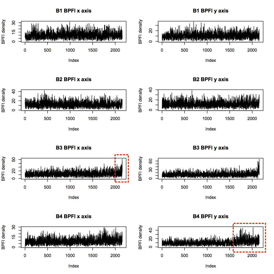
First I’ll consider BPFI. Since bearing 3 failed with an inner race defect, I expect bearing 3 BPFI to increase more than the others over time. Plotting BPFI against file number (file 1 being the start of the experiment, and file 2,156 being the end), does indeed show an increase in BPFI for bearing 3. Bearing 4 also shows an upward trend, particularly in the y axis, but note that the scale is smaller than for bearing 3.
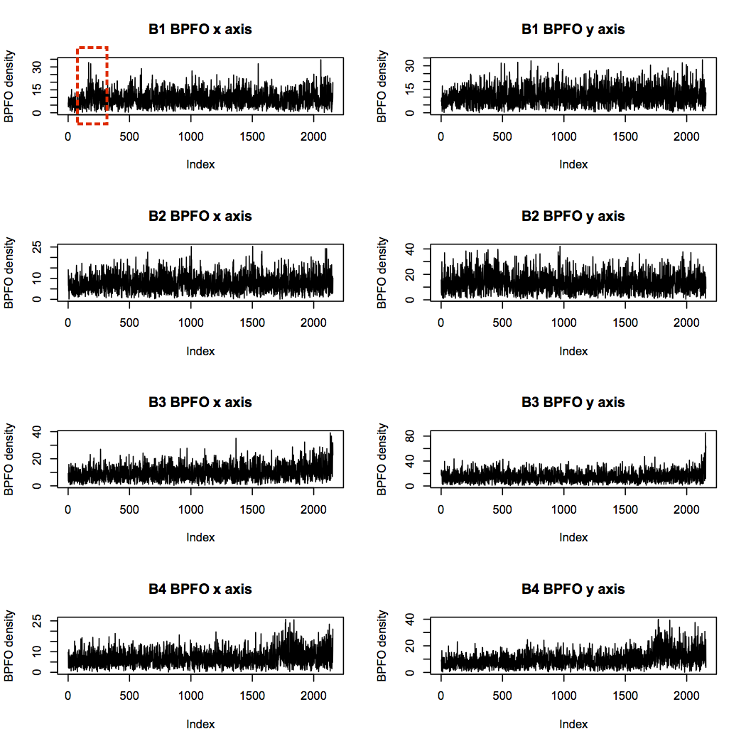
Next is the BPFO. None of the bearings is identified as having an outer race defect, so I wouldn’t expect a particular pattern here. However, bearings 3 and 4 both show increasing levels towards the end of the experiment, likely due to increased vibration overall from debris build-up. Interestingly, bearing 1 has some quite high levels near the start of the experiment, but it seems to reach a steady-state thereafter.
Bearing 4 was diagnosed with a rolling element failure, which suggests a high BSF should be present. There are indeed some significant spikes in BSF power, but these occur around sample 1,750, and die down again before the end of the experiment.
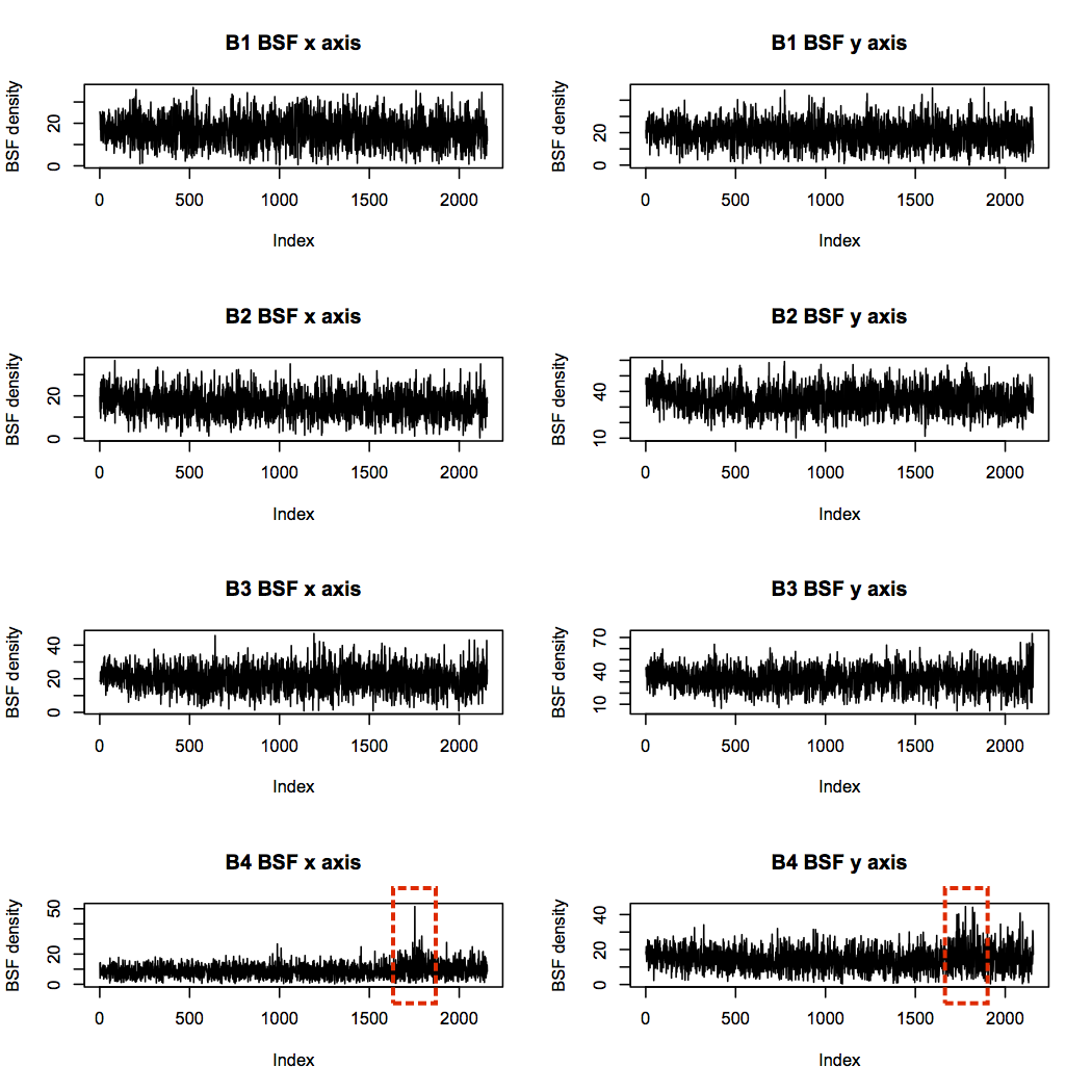
The Mobius Institute explains that a decrease in vibration like this can be caused when all the sharp edges of a fault have been worn away, and the bearing becomes so damaged that it stops vibrating with regularity. In this case, complete failure of the rolling element most likely occurred at the point of highest BSF in the x axis profile, after which the element was too small and irregularly shaped to hit off its neighbours.
Statistical features
The quantiles show some interesting patterns of behaviour (max and min in red, median in black, first and third quantile in blue):
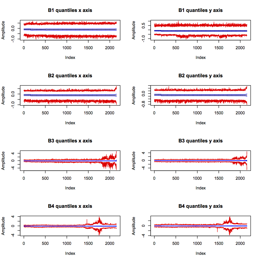
Bearings 3 and 4 show definite increased vibration range around the suspected times of their failures (indicated by the red lines diverging). This supports the theory that bearing 4 actually failed around sample 1,750, and suggests that it was the failure of bearing 3 which halted the experiment.
Bearing 2 was also increasing in range right at the end of the experiment, but the scale is very much smaller than for bearings 3 and 4. This is quite likely to be the onset of a fault which would have developed further if the experiment had continued.
Visually derived features
The power in frequency band features were developed through a mixture of data visualisation, engineering reasoning, and intuition. Therefore I had lowest expectations of these being clear and useful features. However, they show some of the most interesting patterns, and help to confirm the hypotheses developed from the other features.
The low frequency band (below 1.25kHz) contains all the key bearing frequencies, and supports the suspected failure points of bearings 3 and 4. In addition, it supports the idea that bearing 2 had begun to fail, and raises suspicion about the health of bearing 1 near the beginning of the experiment:
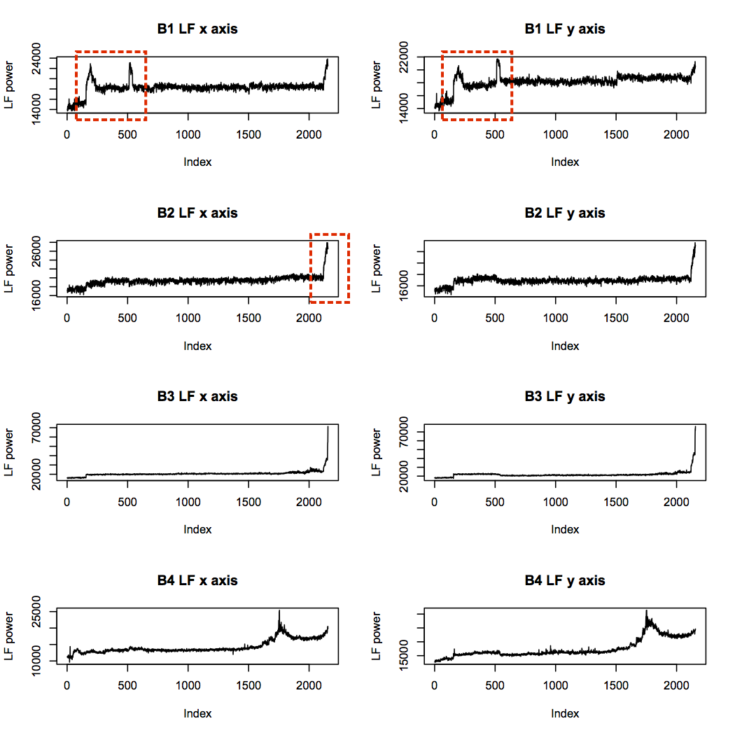
The unusual “humps” in the bearing 1 profile are intriguing, since they are very different from all other profiles, and the first corresponds in time with the spikes in BPFO seen earlier. The maximum power level of these humps is not far from that of the failure point in bearing 4, although much lower than that of bearing 3. This could be indicative of faults introduced at installation time, which show up after a brief run-in period.
The low frequency power trace for bearing 1 looks unusual, but it doesn’t seem to indicate a problem getting progressively worse. The high frequency band is more concerning, as it shows step changes in power levels throughout the life of bearing 1, while the other traces match more closely with their low frequency counterparts:
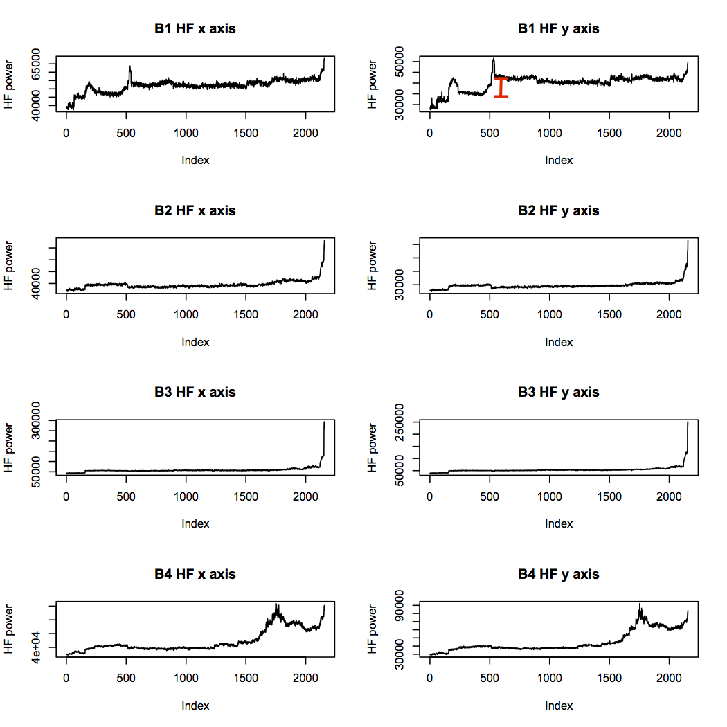
The mid frequency band looks rather similar to the high frequency band, but the very high frequency band is more interesting. While the two failed bearings reach high power levels and stay there, bearings 1 and 2 do not. This is evidence that bearings 3 and 4 had reached an advanced state of failure, whereas bearings 1 and 2, which may have had problems brewing, were not as bad.
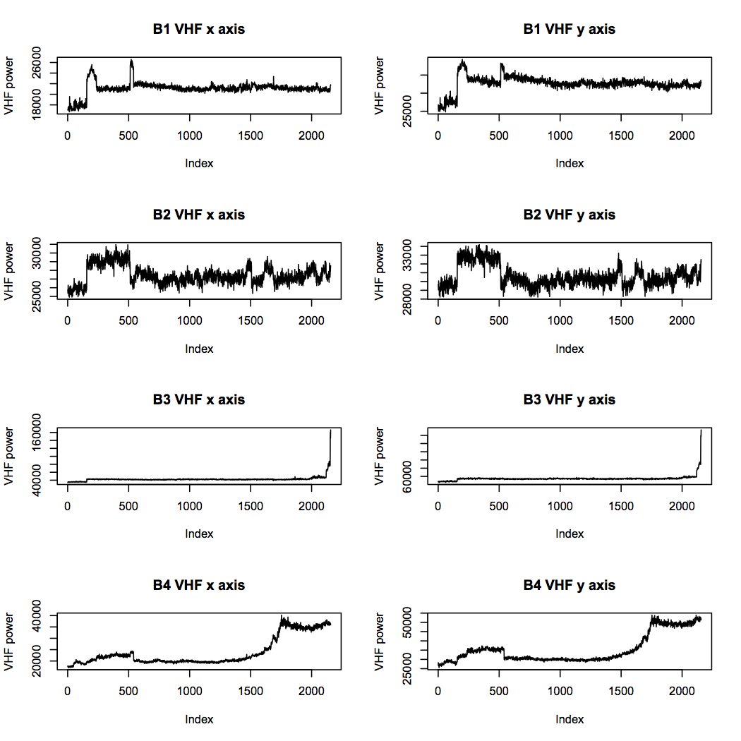
Overall, these features suggest to me that bearing 1 should be considered to be in suspicious health throughout the experiment, even although the experiment notes do not mention any problems. Bearing 2 had most likely also begun to deteriorate towards the end, but had not reached a state of failure. Bearings 3 and 4 show clear signs of the faults that were confirmed by inspection after the experiment. The visually derived features really complement the others in terms of the information they offer.
Conclusions
Calculating useful features is an essential part of identifying patterns within data, and there are three broad categories of features to consider. Domain expertise is always a good starting point, since engineers automatically look for meaningful patterns and trends. Statistical measures can help to characterise a dataset when that domain knowledge is lacking. And finally, visualising the data will give the data scientist a gut feel for what looks interesting, although translating that intuition into a calculation can be challenging.
The next step in the process would be to model deterioration in bearings using these features. Plotting and viewing suggests that some features are more important than others for indicating defects, so a process of feature selection would help to identify a core set with high relevance. However, the generation of a wide set of features is an essential step towards building a diagnostic model, and gives the data scientist a better understanding of what patterns are hidden within.