Features represent important patterns and attributes of a dataset, shrinking large volumes of raw data to more manageable sizes. But not all features are equally useful, and the information contained within a feature may relate to something you’re not interested in modelling. Selecting the most appropriate features is crucial for generating useful models.
Previously, I looked at how to begin analysing a dataset and how to design useful features, to give a large feature vector for an open dataset. In this article, I show how to select features with most relevance to the task at hand. This has the benefits of reducing the dimensionality (and hence the training time) for a data model, while still improving or maintaining accuracy.
Why reduce the feature set?
The last article focused on generating as many features as possible, so why do I want to remove some of them now? The core reason is to reduce the complexity of the resulting model. As a data scientist, I want to create a model that can say something useful about the data, such as classifying fault types or predicting when a failure is about to occur, while keeping the model as simple as possible. The more features in the feature vector, the more dimensions the model has to work with, and the more complex the model becomes.
So why is complexity bad? Consider the structure of a standard neural network: there is an input layer (where features are fed in), a hidden layer (with neurons to combine the inputs), and an output layer (with one neuron per output class). Training lets the network learn the best weights on every input to each neuron, by adjusting the weights slightly after seeing an example from the training set.
If there are more features in the feature vector, there will automatically be more inputs, which means more weights on the hidden layer to learn. Adjusting more weights takes longer, so a more complex model requires a longer time to train. On the other hand, a smaller feature vector means fewer weights in a smaller model, and a faster training time. This is a significant practical benefit, as it could reduce training times from hours to minutes, or minutes to seconds.
Another motivation is that a smaller feature set can often lead to a more accurate model. This counterintuitive result is called the curse of dimensionality, where a larger number of data points will naturally contain more noise and spurious relationships than a smaller dataset, which makes it harder to train an accurate model. If the feature vector contains only the most important and information-rich features, the model can focus more easily on the relationship of interest.
For any model, there will be an optimal set of features which contains enough information to train an accurate model, while minimising duplicate or redundant information which would decrease accuracy. I’ll show how to find this optimal set below.
Feature selection
The aim of feature selection is to find a minimal set of features which contains enough information to train a model to make accurate classifications. This means I need to work out what each feature tells us about the classification, and how important that information is for distinguishing between two classes. If two features contain the same information, I can remove one of them. I’ll do this using correlation, and mutual information.
Labelling the data
First things first, I need something to classify. As before, I’ll use the bearing dataset from University of Cincinnati, and the feature set calculated in the last article. If you followed the previous steps, you can use this snippet to load in the features:
basedir <- "../bearing_IMS/1st_test/"

b1 <- read.table(file=paste0(basedir, "../b1_all.csv"), sep=",", header=TRUE)
b2 <- read.table(file=paste0(basedir, "../b2_all.csv"), sep=",", header=TRUE)
b3 <- read.table(file=paste0(basedir, "../b3_all.csv"), sep=",", header=TRUE)
b4 <- read.table(file=paste0(basedir, "../b4_all.csv"), sep=",", header=TRUE)
Alternatively, download and run the full code from GitHub, before running the snippet above.
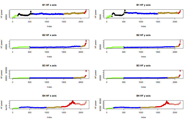
Next, I need to add a column of class labels to the data. Machinery generally experiences an early run-in period, before going through normal behaviour, and finally reaching a faulty state. The experiment notes for the bearing test say that bearing 3 failed with an inner race fault, and bearing 4 failed with a rolling element failure. However, prior examination of the features suggests that bearing 1 was in suspicious health from near the start of the experiment, and bearing 2 had begun to fail by the end.
Therefore I’ll apply the following labels to the data, colour coded in the plot below as green for “early”, blue for “normal”, yellow is “suspect”, and red is “failure”. B1 also includes a black region I’ll call “unknown”, and b4 includes a further stage of failure I’ll call “stage2”.
These labels can be applied in R like this:
b1.labels <- c(rep("early", times=150), rep("unknown", times=450), rep("normal", times=899), rep("suspect", times=600), rep("failure.b1", times=57))
b2.labels <- c(rep("early", times=499), rep("normal", times=1500), rep("suspect", times=120), rep("failure.b2", times=37))
b3.labels <- c(rep("early", times=499), rep("normal", times=1290), rep("suspect", times=330), rep("failure.inner", times=37))
b4.labels <- c(rep("early", times=199), rep("normal", times=800), rep("suspect", times=435), rep("failure.roller", times=405), rep("stage2", times=317))

b1 <- cbind(b1, State=b1.labels)
b2 <- cbind(b2, State=b2.labels)
b3 <- cbind(b3, State=b3.labels)
b4 <- cbind(b4, State=b4.labels)
Now I have a labelled dataset, I can select features that help classify the stage of life of a bearing, from early through to failure type.
Correlation
The first step of feature selection is to identify the strength of relationship, or correlation, between every pair of features. If two features always change at the same time and by related amounts, they display high correlation. Correlation can be quantified as a value between -1 and 1, where 0 means no correlation, 1 means perfect linear correlation, and -1 means the features are perfectly inversely related. Correlation is closely related to covariance, and details of the calculation can be found here.
For a classifier, high correlation between input features is bad, since they will contain the same information about the state of the bearing. Therefore I want to find correlated features and remove as many as possible.
In this specific case, it’s best to use data from the normal state of operation for determining which features are correlated. This is because the failure modes introduce unexpected changes in all of the parameters, which will make it less clear which variables are truly correlated. Since the data is labelled, I can select specifically the points where bearing health looks “normal”.
I’m also not interested in relationships with the timestamp (column 1), or at this point the state label (column 48), so I can remove them. Finally, the F1.x and F1.y parameters (the largest FFT components) change so little in the dataset that correlation calculations are difficult, so I’ll take them out too. The code to produce the normal dataset is therefore:
norm <- rbind(
  cbind((b1[(b1$State == "normal"),-c(1, 16, 39, 48)]), bearing="b1"),
  cbind((b2[(b2$State == "normal"),-c(1, 16, 39, 48)]), bearing="b2"),
  cbind((b3[(b3$State == "normal"),-c(1, 16, 39, 48)]), bearing="b3"),
  cbind((b4[(b4$State == "normal"),-c(1, 16, 39, 48)]), bearing="b4")
)
A correllogram is a neat way of visualising the correlation between pairs of features, where the strength of the colour indicates the strength of the relationship:
library(corrgram)
corrgram(norm)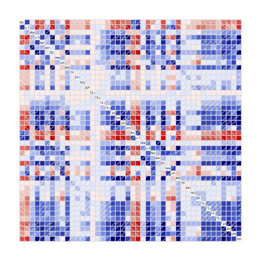
Blue is a positive correlation (when one parameter increases, the other does too), and red is negative correlation (when one increases, the other decreases). White and pale colours indicate little or no correlation. This correlogram shows lots of strong colours, which means lots of high correlation between pairs of parameters. For each feature, I want to list the others which are highly correlated with it – say, correlation above 0.9 or below -0.9:
cor <- cov2cor(cov(norm[, -45]))
alikes <- apply(cor, 2, function(col) { names(Filter(function (val) { val > 0.9 }, sort.int(abs(col), decreasing=TRUE))) } )
cat(str(alikes, vec.len=10))
Min.x : "Min.x"
Qu.1.x : "Qu.1.x" "RMS.x" "LF.pow.x" "SD.x" "Qu.3.x"
Median.x : "Median.x"
Qu.3.x : "Qu.3.x" "SD.x" "RMS.x" "LF.pow.y" "Qu.1.x"
Max.x : "Max.x"
Mean.x : "Mean.x"
SD.x : "SD.x" "RMS.x" "Qu.3.x" "Qu.1.x" "LF.pow.y"
Skew.x : "Skew.x"
Kurt.x : "Kurt.x"
RMS.x : "RMS.x" "SD.x" "Qu.1.x" "Qu.3.x"
FTF.x : "FTF.x"
BPFI.x : "BPFI.x"
BPFO.x : "BPFO.x"
BSF.x : "BSF.x"
F2.x : "F2.x"
F3.x : "F3.x"
F4.x : "F4.x"
F5.x : "F5.x"
VHF.pow.x: "VHF.pow.x" "VHF.pow.y"
HF.pow.x : "HF.pow.x" "MF.pow.x" "HF.pow.y" "SD.y"
MF.pow.x : "MF.pow.x" "HF.pow.y" "SD.y" "HF.pow.x" "RMS.y" "Qu.3.y" "VHF.pow.y"
LF.pow.x : "LF.pow.x" "Qu.1.x"
Min.y : "Min.y"
Qu.1.y : "Qu.1.y" "RMS.y" "LF.pow.y" "SD.y"
Median.y : "Median.y" "Mean.y"
Qu.3.y : "Qu.3.y" "SD.y" "VHF.pow.y" "MF.pow.x" "HF.pow.y" "LF.pow.y"
Max.y : "Max.y"
Mean.y : "Mean.y" "Median.y"
SD.y : "SD.y" "VHF.pow.y" "MF.pow.x" "RMS.y" "HF.pow.y" "Qu.3.y" "LF.pow.y" "Qu.1.y" "HF.pow.x"
Skew.y : "Skew.y"
Kurt.y : "Kurt.y"
RMS.y : "RMS.y" "Qu.1.y" "SD.y" "LF.pow.y" "VHF.pow.y" "MF.pow.x" "HF.pow.y"
FTF.y : "FTF.y"
BPFI.y : "BPFI.y"
BPFO.y : "BPFO.y"
BSF.y : "BSF.y"
F2.y : "F2.y"
F3.y : "F3.y"
F4.y : "F4.y"
F5.y : "F5.y"
VHF.pow.y: "VHF.pow.y" "SD.y" "Qu.3.y" "RMS.y" "VHF.pow.x" "MF.pow.x" "LF.pow.y" "HF.pow.y"
HF.pow.y : "HF.pow.y" "MF.pow.x" "SD.y" "MF.pow.y" "HF.pow.x" "VHF.pow.y" "Qu.3.y" "RMS.y"
MF.pow.y : "MF.pow.y" "HF.pow.y"
LF.pow.y : "LF.pow.y" "Qu.1.y" "RMS.y" "SD.y" "SD.x" "VHF.pow.y" "Qu.3.x" "Qu.3.y"
This list gives candidates for elimination. For example, the feature VHF.pow.x is highly correlated with itself and VHF.pow.y, so one of them can be removed. On the other hand, BPFI.x is only correlated with itself, which suggests no other feature contains the same information as this one.
But there are some groups of features where the correlation is more complex. SD.x is correlated with RMS.x and LF.pow.y, while RMS.x is correlated with SD.x but not LF.pow.y. If I keep SD.x and drop RMS.x, I can also drop LF.pow.y; but if I keep RMS.x and drop SD.x, I’ll also need to include LF.pow.y. Therefore it seems best to include SD.x, but this has knock-on effects for inclusion of other features.
Choosing the minimal set is an optimisation problem called the set covering problem. Luckily I have a friend who knows about optimisation, who helped me write a set cover solver. Running this program gives the minimal set of features with no overlap in correlations. For reference, this set is:
best <- c("Min.x", "Median.x", "Max.x", "Mean.x", "Skew.x", "Kurt.x", "FTF.x", "BPFI.x", "BPFO.x", "BSF.x", "F2.x", "F3.x", "F4.x", "F5.x", "Min.y", "Max.y", "Skew.y", "Kurt.y", "FTF.y", "BPFI.y", "BPFO.y", "BSF.y", "F2.y", "F3.y", "F4.y", "F5.y", "Qu.1.x", "VHF.pow.x", "Qu.1.y", "Median.y", "HF.pow.y")At this point, I have a minimal set of features which have low levels of correlation, but I still don’t know which features are most relevant for classifying bearing state. To prepare for the next stage of analysis, I’ll collate all bearing data into one large matrix, taking only the minimal set of features, the bearing state labels, and adding a column to identify the bearing:
data <- rbind(
  cbind(bearing="b1", (b1[,c("State", best)])),
  cbind(bearing="b2", (b2[,c("State", best)])),
  cbind(bearing="b3", (b3[,c("State", best)])),
  cbind(bearing="b4", (b4[,c("State", best)]))
)
write.table(data, file=paste0(basedir, "../all_bearings.csv"), sep=",", row.names=FALSE)
Mutual information
The next step is to identify the most important features for classifying bearing state, which I’ll do by calculating Mutual Information. Some features may be information-rich, but the information is about something unrelated to bearing state. An example would be width of the bearing, which is an important parameter for separating different types of bearing, but holds no information about the state of health of the experiment bearings. What I really want to know is how much information each feature can give about bearing state.
Mutual Information is calculated by the difference in independent and conditional entropy of the bearing state. More simply, it’s a measure of how much more certain we can be of the bearing’s state if we know the feature’s value (conditional entropy). If a feature contains little information about bearing state, we’ll be no more sure of bearing health whether we know the value of the feature or not.
In R, Mutual Information can be calculated with the entropy package:
library("entropy")
H.x <- entropy(table(data$State))
mi <- apply(data[, -c(1, 2)], 2, function(col) { H.x + entropy(table(col)) - entropy(table(data$State, col))})
sort(mi, decreasing=TRUE)
Which ranks the features according to how much information they offer:
    Skew.x    Kurt.x     FTF.x    BPFI.x    BPFO.x     BSF.x
 1.4318662 1.4318662 1.4318662 1.4318662 1.4318662 1.4318662
    Skew.y    Kurt.y     FTF.y    BPFI.y    BPFO.y     BSF.y
 1.4318662 1.4318662 1.4318662 1.4318662 1.4318662 1.4318662
 VHF.pow.x  HF.pow.y    Mean.x    Qu.1.x    Qu.1.y      F5.y
 1.4318662 1.4318662 1.4026494 0.5539613 0.5328388 0.5225875
      F5.x      F4.y      F3.y      F4.x      F2.y      F3.x
 0.5007170 0.4942429 0.4937412 0.4800929 0.4558328 0.4472345
     Max.x     Min.x     Max.y     Min.y      F2.x  Median.y
 0.3743911 0.3487148 0.3460297 0.3381148 0.2632983 0.2313810
  Median.x
 0.2261523
Interestingly, the first 14 features are all equally informative about bearing state. The features at the bottom of this list are candidates for removal, since they contribute least information to the classification, and therefore may just introduce more noise than benefit to the classifier. The only way to be sure is to train some classifiers using different selections of the features at the top of the list, and compare accuracy.
For this I’ll use a decision tree classifier called RPART. This is a simple model to parameterise and quite fast to train, so it’s perfect for rapid prototyping. Since I’m not doing any further data manipulation and using default parameters for the model, the resulting classifiers can almost certainly be improved. I’m not currently interested in the absolute accuracy, but only in the relative accuracy of classifiers using different feature vector lengths.
I’ll use every 4th datapoint as the training set, and test feature vectors of length 2 (Skew.x and Kurt.x only) up to 31 (the optimised set of uncorrelated features). This requires building the formula programmatically, training the rpart model, generating predictions, and calculating the accuracy of predictions for those rows not in the training set:
library("rpart")
library("caret")

train.rows <- seq(1, length(data$State), by=4) # every fourth index
sorted <- names(sort(mi, decreasing=TRUE))
accuracies <- vector()

for (i in 2:length(sorted))
{
	form <- paste0("data$State ~ data$", Reduce(function (r, name) { paste(r, paste0("data$", name), sep=" + ") }, sorted[1:i]))
	model <- rpart(as.formula(form), data, subset=train.rows)
	pred <- predict(model, data, type="class") # contains train and test set predictions
	cm <- confusionMatrix(pred[-train.rows], data[-train.rows, 2]) # only the non-training rows
	# pull out the answer
	accuracies <- c(accuracies, cm["overall"][[1]]["Accuracy"][[1]])
}

plot(accuracies, xlab="Number of features", ylab="Accuracy")
This generates the following graph:
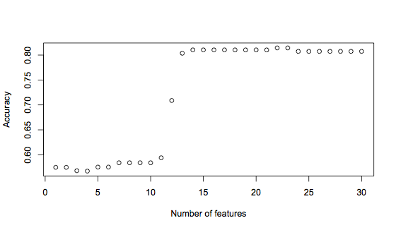
It’s clear to see here that using the first 12 features significantly improves the accuracy, from under 60% to 71%. But adding one more feature increases accuracy again, to 81%. Finally, there is another small rise in accuracy when 22 or 23 features are used. This graph suggests that a good trade-off between having enough information versus introducing noise is a feature vector of 14 features, with the possibility for improvement with 22 features. The 14 feature vector is:
"Skew.x"    "Kurt.x"    "FTF.x"     "BPFI.x"    "BPFO.x"
"BSF.x"     "Skew.y"    "Kurt.y"    "FTF.y"     "BPFI.y"
"BPFO.y"    "BSF.y"     "VHF.pow.x" "HF.pow.y"
Conclusion
This process of feature selection has reduced 46 features down to the most essential 14, which means the resulting classifier will be less complex, train faster, and tend to be more accurate than if the full set of features were used.
The next step is to work on training a classifier to recognise bearing state. There are many, many techniques which could be used for this, and a process of technique selection and testing can help to navigate the possibilities. Ultimately, spending time on the feature selection stage simplifies technique training, so applying the approach outlined in this article will make the next stage smoother and faster.