One of the best tools for data science is clustering, where groupings of datapoints are revealed just by calculating their similarity to others. This article introduces k-means clustering for data analysis in R, using features from an open dataset calculated in an earlier article.
From features to diagnosis
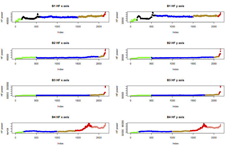
The goal of this analysis is to diagnose the state of health of four bearings. These bearings were run from installation until an end-of-life point, and accelerometer data was captured throughout. At the end of the experiment, inspection showed that two bearings had failed: b3 with an inner race defect, and b4 with a rolling element failure. Through feature extraction and dimensionality reduction, I identified 14 features which contain rich information about bearing health. It also looked like b1 and b2 were on the point of failure when the experiment ended.
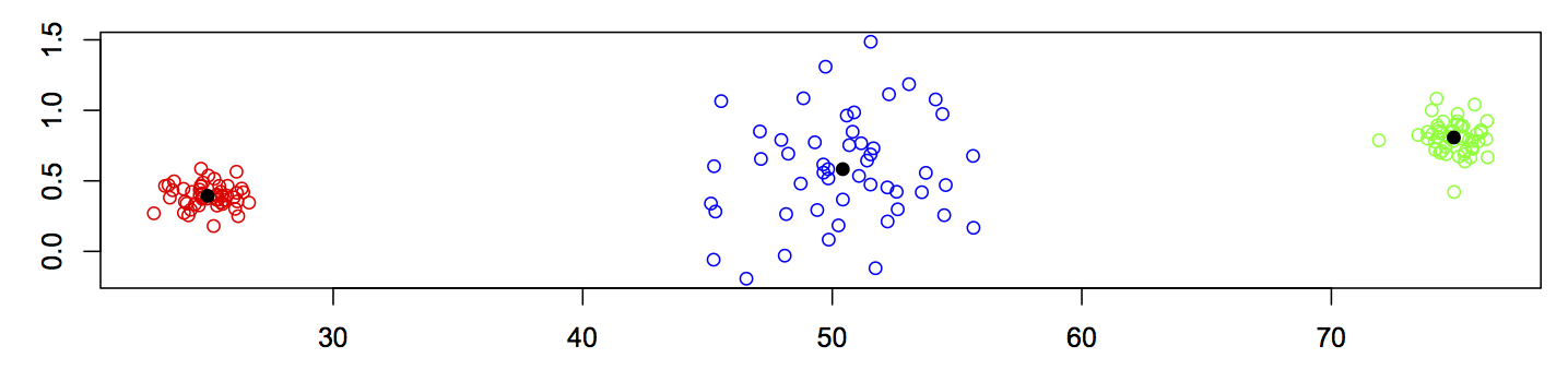
Visual inspection of these features allowed me to identify the points at which it looked like bearing health was changing, and therefore put labels on each datapoint. The labels are shown for two features below, colour-coded as:
- green: “early” (initial run-in of the bearings)
- blue: “normal”
- yellow: “suspect” (health seems to be deteriorating)
- red: “failure.b1”, “failure.b2”, “failure.inner”, or “failure.roller”
- salmon: “stage2” (secondary failure of b4)
- black: “unknown” (unusual activity in b1)
If you followed the last article, you can read in the features and labels with this code:
basedir <- "../bearing_IMS/1st_test/"
data <- read.table(file=paste0(basedir, "../all_bearings_best_fv.csv"), sep=",", header=TRUE)
Otherwise, download and run the code from GitHub, before running the snippet above.
Before I train a classifier to automatically diagnose bearing health, I want to check that the labels I previously assigned to the data have some validity. Humans are very good at pattern-matching, but sometimes assign a pattern when none exists. In particular, I want to see if the “unknown” datapoints are really a separate class, or whether they should be considered normal, suspect, or something else. Secondly, I want to know if “failure.b1” or “failure.b2” are similar to the other failure modes, or whether they should be kept separate. Overall, I want to see if any of my labels should be merged, or separated into multiple groupings.
K-means clustering
The algorithm I’ll use for this is k-means. This is an unsupervised learning technique, which means it reveals underlying structure in the data without being told the labels I’ve assigned. In contrast, a supervised learning technique like a neural network uses the labels to check how well it’s learned the groupings, which is great when you’re sure of your class labels. In this case, I want to check how appropriate my labels are, so an unsupervised technique is better.
Cluster analysis assumes that the data clearly changes when the bearing passes from one state of health to another. This could be as simple as a single parameter showing a step change, so that all the data relating to the previous state is below a critical threshold, while all the data from the new state is above the threshold. Clustering would highlight this relationship, and identify the threshold separating the two clusters.
K-means works by separating the training data into k clusters. It calculates the centre point (mean) of each cluster, giving k means. New datapoints are clustered based on their distance to all the cluster centres: the nearest cluster is considered the most similar and best fit. Some good examples of the k-means learning process are given here.
Choosing k
While k-means is unsupervised, it does need to know how many clusters the data scientist expects to find in the data. Usually, k is chosen to be close to the number of labels, but it’s very difficult to pick the best number without trying out a few different values.
For the bearing data, I’m fairly sure of six labels (early, normal, suspect, failure.inner, failure.roller, and stage2). The other three (unknown, failure.b1, and failure.b2) could be alternative names for some of these. Therefore, the minimum number of clusters I’m reasonably expecting is six.
On the other hand, sometimes a behaviour will manifest in more than one way. Normal behaviour for b3 looks somewhat different from normal for b4, so it could be that the normal label should apply to more than one cluster. Since I have nine labels in total, I’ll double this to 18 for an upper bound on k.
If I’m going to try every k from 6 to 18, I don’t want to do all the analysis manually. I need a way of calculating goodness of fit of the model, so I can work out which value of k fits the data best. To do this, I need some way of calculating how consistently datapoints with the same label are clustered together.
The first step is to train a model on the data, excluding columns 1 and 2 for the bearing and state labels:
k <- 8
means <- kmeans(data[,-c(1, 2)], k)
This returns a kmeans object, which includes a cluster parameter. This lists the cluster number allocated to every datapoint in the input dataset. From this, I can calculate a table of labels versus cluster numbers, to reveal the spread:
table(data.frame(data$State, means$cluster)) means.cluster
data.State 1 2 3 4 5 6 7 8
early 0 343 305 167 0 332 156 44
failure.b1 57 0 0 0 0 0 0 0
failure.b2 29 2 0 0 1 3 0 2
failure.inner 0 0 0 0 37 0 0 0
failure.roller 233 14 0 0 158 0 0 0
normal 810 1290 0 985 0 515 0 889
stage2 0 20 0 0 297 0 0 0
suspect 725 214 0 0 116 120 0 310
unknown 146 0 6 0 0 0 0 298
This shows that data with the early label is split quite evenly across clusters 2, 3, 4, 6, and 7, whereas failure.b1 is confined to cluster 1. Looking at columns instead of rows, cluster 7 contains only early data, but cluster 1 contains many different labels. This is indicative of accuracy, but it’s hard to draw conclusions—partly because there are such uneven numbers of datapoints with each label. I’ll convert each row to percentages, and wrap the whole thing as a function:
calculate.confusion <- function(states, clusters)
{
  # generate a confusion matrix of cols C versus states S
  d <- data.frame(state = states, cluster = clusters)
  td <- as.data.frame(table(d))
  # convert from raw counts to percentage of each label
  pc <- matrix(ncol=max(clusters),nrow=0) # k cols
  for (i in 1:9) # 9 labels
  {
    total <- sum(td[td$state==td$state[i],3])
    pc <- rbind(pc, td[td$state==td$state[i],3]/total)
  }
  rownames(pc) <- td[1:9,1]
  return(pc)
}
Next, I need to assign labels to the clusters, which I’ll do as a two stage process. First, every cluster should have a label. For every cluster, I’ll look down its column and pick the label that has the highest percentage of datapoints assigned to it. Note that this can result in two or more clusters having the same label, as in clusters 3 and 7 above which both have “early” as the highest percentage label.
For step 2, every label should be associated with at least one cluster, otherwise k-means will never be able to diagnose that label. For every label which isn’t already assigned to a cluster, I’ll look along its row and assign it to the cluster that the majority of its datapoints are assigned to. This can result in a cluster having more than one label associated with it.
assign.cluster.labels <- function(cm, k)
{
  # take the cluster label from the highest percentage in that column
  cluster.labels <- list()
  for (i in 1:k)
  {
    cluster.labels <- rbind(cluster.labels, row.names(cm)[match(max(cm[,i]), cm[,i])])
  }

  # this may still miss some labels, so make sure all labels are included
  for (l in rownames(cm))
  {
    if (!(l %in% cluster.labels))
    {
      cluster.number <- match(max(cm[l,]), cm[l,])
      cluster.labels[[cluster.number]] <- c(cluster.labels[[cluster.number]], l)
    }
  }
  return(cluster.labels)
}
These two functions can be used together, and the resulting list of cluster labels visualised:
str(assign.cluster.labels(calculate.confusion(data$State, means$cluster), k))List of 8
$ : chr [1:4] "failure.b1" "failure.b2" "failure.roller" "suspect"
$ : chr "normal"
$ : chr "early"
$ : chr "normal"
$ : chr [1:2] "failure.inner" "stage2"
$ : chr "early"
$ : chr "early"
$ : chr "unknown"
In this case, cluster 1 represents three of the failure classes as well as “suspect”, while clusters 3, 6, and 7 contain “early” data.
We’re almost there. The final step is to check through the state labels of each datapoint, and compare them against the cluster labels of the corresponding cluster number in means$cluster. If the cluster labels contain the state label, it’s counted as a hit; if the state label isn’t there, it’s a miss. The accuracy is the percentage hits from the full dataset:
calculate.accuracy <- function(states, clabels)
{
  matching <- Map(function(state, labels) { state %in% labels }, states, clabels)
  tf <- unlist(matching, use.names=FALSE)
  return (sum(tf)/length(tf))
}
All that remains is to test for multiple values of k in the range six to 18:
results <- matrix(ncol=2, nrow=0)
models <- list()

for (k in 6:18)
{
  # Don't cluster columns for bearing or State
  means <- kmeans(data[,-c(1, 2)], k)

  # generate a confusion matrix of cols C versus states S
  conf.mat <- calculate.confusion(data$State, means$cluster)
  cluster.labels <- assign.cluster.labels(conf.mat, k)

  # Now calculate accuracy, using states and groups of labels for each cluster
  accuracy <- calculate.accuracy(data$State, cluster.labels[means$cluster])
  results <- rbind(results, c(k, accuracy))
  models[[(length(models)+1)]] <- means
}
Since k-means randomly picks the starting cluster centres, subsequent runs can give very different results. This loop can be run a few times to generate more than one model for each value of k.
Visualising the best model
After training lots of models, I want to find the best one and inspect it. The results matrix holds the accuracy values, so the best one can be found, extracted, and saved for later:
best.row <- match(max(results[,2]), results[,2])
best.kmeans <- models[[best.row]]
save(best.kmeans, file=paste0(basedir, "../../models/kmeans.obj"))
First, I’ll pull out some key information like the number of clusters and accuracy:
k <- length(best.kmeans$size)
conf.mat <- calculate.confusion(data$State, best.kmeans$cluster)
cluster.labels <- assign.cluster.labels(conf.mat, k)
acc <- calculate.accuracy(data$State, cluster.labels[best.kmeans$cluster])
cat("For", k, "means with accuracy", acc, ", labels are assigned as:\n")
cat(str(cluster.labels))
After a few runs, this was the best model I found:
For 12 means with accuracy 0.6115492 , labels are assigned as:
List of 12
 $ : chr "failure.b2"
 $ : chr "normal"
 $ : chr "unknown"
 $ : chr "stage2"
 $ : chr "failure.inner"
 $ : chr "normal"
 $ : chr "early"
 $ : chr "normal"
 $ : chr "early"
 $ : chr "early"
 $ : chr [1:3] "failure.b1" "failure.roller" "suspect"
 $ : chr "early"
This means that based on the automatic assignment of labels to clusters, 61% of the data fell into a cluster with its assigned label. It also suggests that suspect behaviour looks a lot like the b1 failure, and also the failure of the rolling element in b4 (since cluster 11 has all these labels).
Next, I’ll plot the four bearings sequentially (as in the feature plots above), but showing how the data moves between clusters as the experiment progresses. The colours are matched to the labels as before:
# use the same colours for states as before
cols <- do.call(rbind, Map(function(s)
  {
    if (s=="early") "green"
    else if (s == "normal") "blue"
    else if (s == "suspect") "darkgoldenrod"
    else if (s == "stage2") "salmon"
    else if (s == "unknown") "black"
    else "red"
  }, data$State))


# plot each bearing changing state
par(mfrow=c(2,2))
for (i in 1:4)
{
  s <- (i-1)*2156 + 1 # 2156 datapoints per bearing
  e <- i*2156
  plot(best.kmeans$cluster[s:e], col=cols[s:e], ylim=c(1,k), main=paste0("Bearing ", i), ylab="Cluster")
}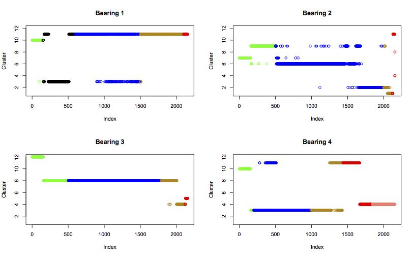
Cluster analysis
The plot can now be compared with the assigned cluster labels:
-
Cluster 1 is labelled “failure.b2”, and it does only contain datapoints from b2 right before and during its failure. This seems a reasonable match. It doesn’t help me to identify what failure mode b2 was experiencing, because it seems to be different from all others.
-
Cluster 2 is labelled “normal”, but it only contains data from b2 towards the end of its normal behaviour and into the suspect region. It might be worth considering this cluster to be a new state, indicative of suspicious health prior to a b2 type of failure.
-
Cluster 3 is “unknown”, since the majority of the strange b1 datapoints fall into this cluster. However, it also contains significant numbers of normal b1 datapoints, and normal and suspect b4 datapoints. In addition, it is the more normal-looking middle points of the unknown region that are in cluster 3, while the stranger start and end points are in cluster 11. Therefore, it’s more accurate to label this cluster, and the batch of unknown data within it, as “normal”.
-
Cluster 4 is labelled “stage2”, and contains failure and stage 2 data from b4. It also contains a few failure and suspect points from b3, and a couple of failure points from b2. This seems a good match of label to cluster, suggesting advanced failure.
-
Cluster 5 is labelled “failure.inner”, and contains only failure data from b3. This is a good match.
-
Clusters 6 and 7 are labelled “normal” and “early”, and only contain normal and early points from b2. These both seem like good fits.
-
Cluster 8 is labelled “normal”, and contains mostly b3 normal data. It also contains some early and suspect data from b3, suggesting the normal label could be extended earlier and later in time for this bearing, but that the label is a good match for the cluster.
-
Cluster 9 is labelled “early”, and contains early data from b2. However, b2 has prior early data in cluster 7, suggesting that this data in cluster 9 is not the same as the early run-in of b2. A better fit could be to relabel this data normal.
-
Cluster 10 is labelled “early”, and contains early data from b1 and b4. This is a good fit.
-
Cluster 11 is labelled “failure.b1”, “failure.roller”, and “suspect”. It contains data from b2 right at the end of the experiment, data from b4 as it crosses from suspect health to a failure state, and data from b1 from all of its life after the initial event labelled “unknown”. This suggests that cluster 11 does relate to failure. It also implies that b1 sustained some damage near the start of the experiment, which manifests in a similar way to a rolling element failure. The label applied to this cluster could be simplified to “failure.roller”.
-
Cluster 12 is labelled “early”, and contains early data from b3. This seems a good fit.
Interestingly, what is considered normal is different for each bearing, as they all fall into different clusters. The expection to this is a few of b1’s normal points falling into the same cluster as b4’s normal (cluster 3). Also, the early run-in behaviour of b1 and b4 are clustered together, both falling into cluster 10. Therefore, bearings 1 and 4 can be considered quite similar.
Bearing 2 displays some erratic behaviour, bouncing between two or three clusters for most of its life. But right at the end of the experiment it moves into clusters which it hadn’t touched before, which strengthens the argument that it had reached the point of failure. Bearing 3 is much more steady throughout its life, but this only makes the failure clearer as it moves to clusters 4 and 5.
One final visualisation is to look at the cluster centres in feature space for all bearings. Since the feature vector has 14 dimensions this can be challenging, but one way is to view the means in 2-dimensional slices. These plots show the labelled data using the same colours as before, with the cluster centres superimposed in black:
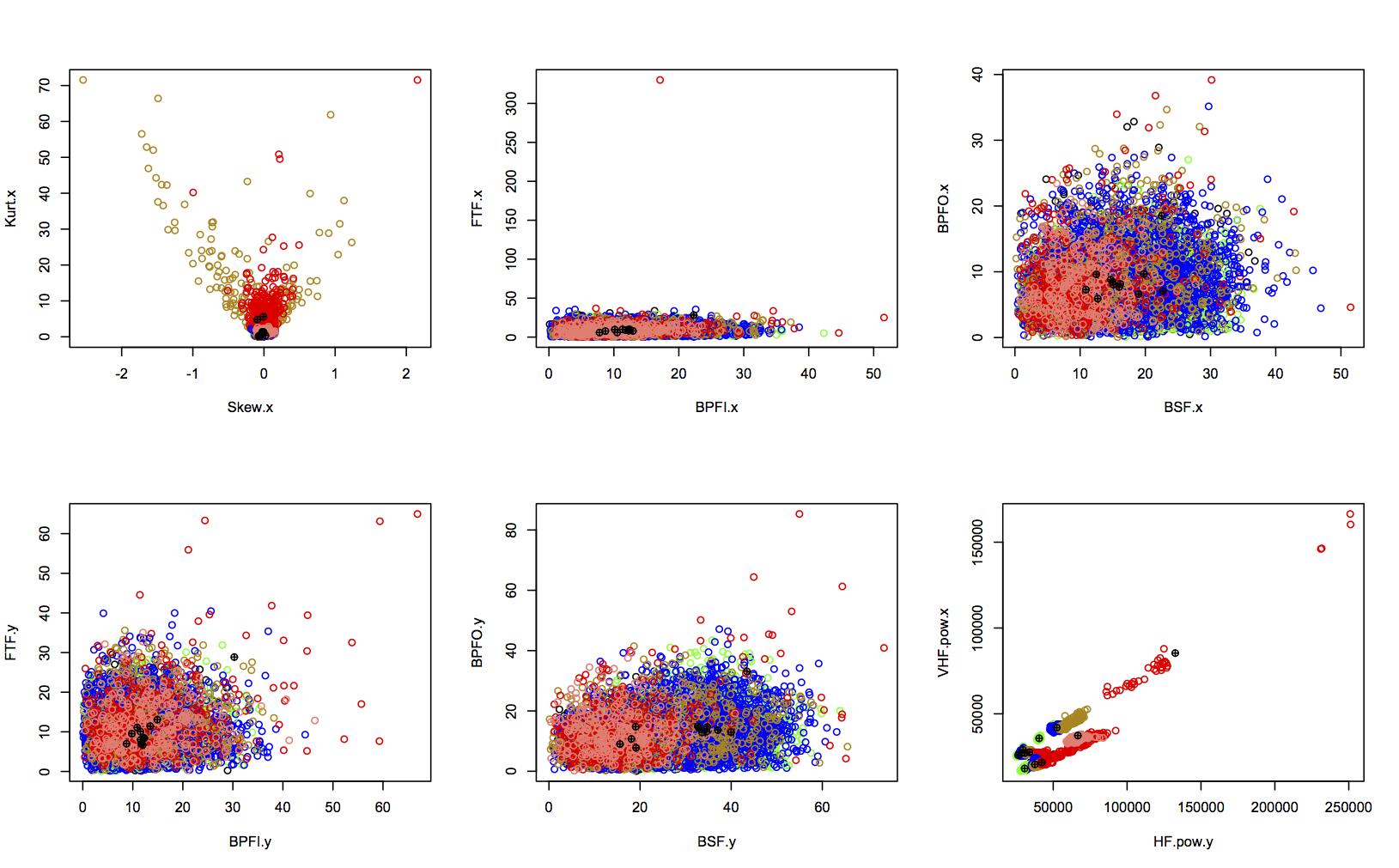
In this case the plot is not very informative, since the 2-d slices don’t convey spatial relationship very well!
Conclusion
To sum up, the labels I previously assigned to the data seem to be a relatively good fit for the clusters found through unsupervised mining of the data. I can use these results to adjust the labels for a better fit, specifically:
- Assigning the datapoints in cluster 2 to a new label of “suspect.failure.b2”,
- Relabelling the “unknown” datapoints in cluster 3 to “normal”,
- Relabelling the “early” datapoints in cluster 9 to “normal”,
- Relabelling the “failure.b1” datapoints to “failure.roller”.
To take this work further, I would next aim to train a diagnostic classifier using supervised learning. Now that k-means has given validity to the visually-chosen labels, I can be more confident that a classifier will learn patterns in the data well.