Getting stuck in to a data science problem can be intimidating. This article shows one way to start, by using R to examine an open dataset. Keep reading for a walkthrough of how to:
- Read data into R
- Generate simple stats and plots for initial visualisation
- Perform a Fast Fourier Transform (FFT) for frequency analysis
- Calculate key features of the data
- Visualise and analyse the feature space
An open dataset: bearing vibration
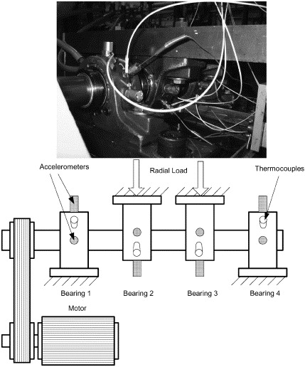
The data I’m using is from the Prognostics Data Repository hosted by NASA, and specifically the bearing dataset from University of Cincinnati. This data was gathered from an experiment studying four bearings installed on a loaded rotating shaft, with a constant speed of 2,000rpm. The test setup is shown below (from Qiu et al):
In the course of this experiment, some of the bearings broke down. I decided to look at the data in detail, to see if I could identify early indicators of failure.
What are bearings?
It’s always useful to understand the subject of any dataset you want to analyse. Without a basic level of knowledge on the systems and processes that the data represents, you can easily go down blind alleys in your analysis.
Bearings are key components of all types of rotating machinery, from simple desk fans to nuclear power station turbines. Anything with a motor or generator rotates a shaft, and the health of the bearings determines how smoothly and efficiently that shaft rotates. Poor lubrication of the bearing will generate extra friction, which reduces efficiency and can also damage the bearing or shaft. In the worst cases, the bearing can scuff or crack, and metal particles break free to hit and damage other parts of the machine.
Experiment and data
A common method of monitoring bearings is to measure vibration. The more smoothly the system is operating, the lower the level of vibration. To measure this, the experiment used two accelerometers per bearing (one each for the x and y axes). Data was recorded in 1 second bursts every 5 or 10 minutes, and the sampling rate was 20kHz.
When you download and unzip the dataset, it contains a PDF describing the experiment and data format, and three RAR files of data. Extracting 1st_test.rar gives a directory containing 2,156 files. Each file is named with its timestamp, and contains an 8 × 20,480 matrix of tab-separated values. The 8 columns correspond to the accelerometers (2 each for 4 bearings), and the rows are the 20kHz samples from 1 second of operation.
This raises a question about the data. If the sampling rate is 20kHz and each file contains 1 second of data, there should be 20,000 rows of data. Since there are 20,480, one of these pieces of information about the data is wrong. Is it the sampling rate or the time period?
It’s more likely that the sampling rate is correct and that each file contains just over 1 second of data. For high frequency data capture, it’s imperative that the sampling rate is correctly adhered to. If a 20kHz setting is actually sampling at 20.48kHz, it introduces significant error into the experiment. On the other hand, 20,480 samples at a rate of 20kHz gives a time period of 1.024s, which is close enough to be rounded down to “1 second” in the text documentation.
It’s important to check that all the information you have about your data is consistent. Discrepancies can indicate a misunderstanding, which can in turn lead to invalid results from your investigation.
Importing the data
Being fairly confident that I understand what this data is now, it’s time to read it into R. A pattern I use regularly is to set a variable basedir with the path to the directory I’m working in, then combine this with a specific filename using paste0. (The paste0 function is strangely named, but it just joins strings together with 0 characters between them.) Since the source data is in text format, with no column headers, and columns separated by tabs, the read in code is like this:
basedir <- "/Users/vic/Projects/bearings/bearing_IMS/1st_test/"
data <- read.table(paste0(basedir, "2003.10.22.12.06.24"), header=FALSE, sep="\t")
head(data)
Calling head on the data is just to check that the read has done what I expect, and should give this:
      V1     V2     V3     V4     V5     V6     V7     V8
1 -0.022 -0.039 -0.183 -0.054 -0.105 -0.134 -0.129 -0.142
2 -0.105 -0.017 -0.164 -0.183 -0.049  0.029 -0.115 -0.122
3 -0.183 -0.098 -0.195 -0.125 -0.005 -0.007 -0.171 -0.071
4 -0.178 -0.161 -0.159 -0.178 -0.100 -0.115 -0.112 -0.078
5 -0.208 -0.129 -0.261 -0.098 -0.151 -0.205 -0.063 -0.066
6 -0.232 -0.061 -0.281 -0.125  0.046 -0.088 -0.078 -0.078
These column names are not very intuitive, so I renamed them like this:
colnames(data) <- c("b1.x", "b1.y", "b2.x", "b2.y", "b3.x", "b3.y", "b4.x", "b4.y")Initial analysis
There is a vast array of possible analysis and modelling techniques I could apply to this data, and 2,155 more files to read in. However, at this stage I don’t have a good feel for what the data looks like or how it behaves, so I can’t yet decide the best way to format, store, or clean the data.
Data mining is an iterative process where you look at the data from a certain angle to generate ideas for more interesting angles to consider next. Simplest is always the best way to start:
summary(data$b1.x)
plot(data$b1.x, t="l") # t="l" means line plot
Min. 1st Qu. Median Mean 3rd Qu. Max.
-0.72000 -0.14600 -0.09500 -0.09459 -0.04200 0.38800
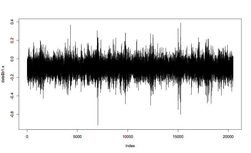
Looking just at the x axis of bearing 1 to start with, you can see that the mean vibration value is less than 0, and mostly within the band between 0.0 and -0.2. The max and min values (0.388 and -0.720) are outliers, but not orders of magnitude different from the rest of the data, and therefore can’t be discounted as bad data. The spikes in value seem regularly spaced, and a spike in negative value always seems to correspond with an extreme positive value, which tends to suggest these outliers are true measurements. Analysis of the other columns shows very similar patterns, with a slight tendency for the y axes to have a mean closer to 0, but higher extreme values.
Each plot represents a one second snapshot in the life of that bearing. To perform an analysis of the data, I need to consider all of the snapshots together. Obviously, looking at every plot isn’t going to work, so how do I process the data?
Feature extraction or big data?
I need to find a way to work with this relatively large data set. There are basically two approaches to this problem.
The first I’ll call the traditional engineering approach. 20,480 is a very high number of data points to represent one measurement, and there are over 2,000 such snapshots. The traditional approach is to try and condense this data down through feature extraction. I could calculate for each file a handful of representative features, such as mean, max, and min values, and the relative size of key harmonic frequencies. With 2,156 files, I would end up with 2,156 rows of (say) 8 columns of features, and can much more easily perform modelling on this condensed dataset.
An alternative could be called the big data approach. 20,480 × 2,156 is “only” 44 million datapoints, and with a good pipeline of tools and some CPU time, I can perform analytics on the full data without needing to condense it. It is only recently that this approach has become feasible, so there is less experience and guidance around about how to do this efficiently.
On the plus side, feature extraction aims to reduce the amount of data you have to process, by drawing signal out of noise. As long as your features are representative of the process you are trying to model, nothing is lost in the condensing process, but the modelling itself become much easier. On the other hand, if your features don’t actually describe the underlying process, you may be losing valuable information from the source data.
To begin with, I’ll take the engineering approach. Time to extract some features!
Formatting the full dataset
To collect the data into a format useful for further analysis, I need to process the 2,156 time ordered source files into 4 files of bearing-specific data. Each bearing file will contain 2,156 rows (one per source file), containing the timestamp and key features calculated from both the x and y axes.
Conventional wisdom for bearing analysis says that the most important features are the levels of vibration at key frequencies, relating to rotation and spin of the bearing elements. Since I don’t have the engineering specs for the bearing, these frequencies are difficult to calculate. So for now, I’ll take more of a data-driven approach and focus on patterns in the data.
A vibration signal can be decomposed into its frequency components using the Fast Fourier Transform (FFT). Simply calling the R function fft returns data in an unfriendly format, but it’s straightforward to turn it into a more intuitive version:
b1.x.fft <- fft(data$b1.x)
# Ignore the 2nd half, which are complex conjugates of the 1st half,
# and calculate the Mod (magnitude of each complex number)
amplitude <- Mod(b1.x.fft[1:(length(b1.x.fft)/2)])
# Calculate the frequencies
frequency <- seq(0, 10000, length.out=length(b1.x.fft)/2)
# Plot!
plot(amplitude ~ frequency, t="l")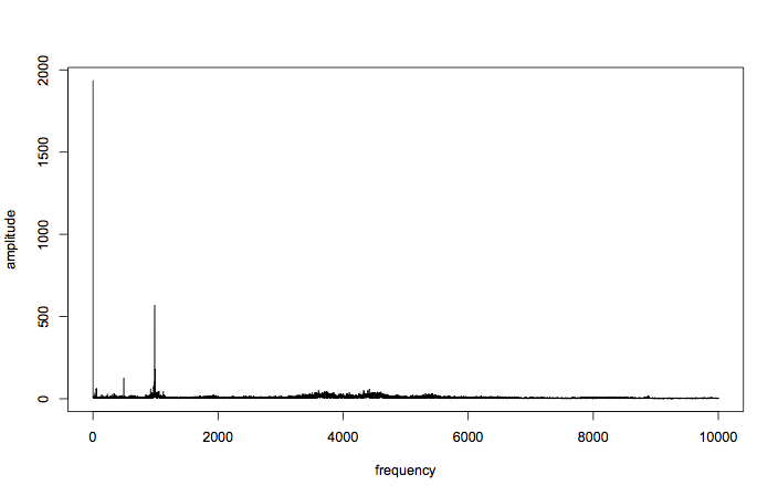
Great! You can see that all the good stuff is going on down at the lower frequencies, although there is a ripple of activity just above and below 4kHz, and around 8kHz. For now, let’s focus on the lower frequencies.
plot(amplitude ~ frequency, t="l", xlim=c(0,1000), ylim=c(0,500))
axis(1, at=seq(0,1000,100), labels=FALSE)  # add more ticks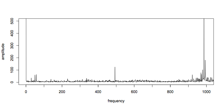
Other than the dc term (at 0Hz), the tallest spikes are just below 1kHz. There is also a large spike just below 500Hz, and two around 50Hz. Tabulating the top 15 frequencies gives:
sorted <- sort.int(amplitude, decreasing=TRUE, index.return=TRUE)
top15 <- sorted$ix[1:15] # indexes of the largest 15
top15f <- frequency[top15] # convert indexes to frequencies
[1] 0.00000 986.42446 993.26106 493.21223 979.58785
[6] 994.23772 969.82127 971.77459 57.62281 978.61119
[11] 921.96504 49.80955 4420.35355 3606.79754 4327.57105
So those outliers are at 49.8Hz, 57.6Hz, and 493Hz. Interestingly, the second and fourth largest components have a harmonic relationship (493Hz * 2 = 986Hz), which strongly suggests they are linked.
For now, I’ll focus on the frequencies of the largest five components. Since each bearing has an x and y axis, this means there will be 10 features total. I’ll wrap the FFT profiling code in a function for ease of use later:
fft.profile <- function (dataset, n)
{
	fft.data <- fft(dataset)
	amplitude <- Mod(fft.data[1:(length(fft.data)/2)])
	frequencies <- seq(0, 10000, length.out=length(fft.data)/2)

	sorted <- sort.int(amplitude, decreasing=TRUE, index.return=TRUE)
	top <- sorted$ix[1:n] # indexes of the largest n components
	return (frequencies[top]) # convert indexes to frequencies
}
I want to keep the time of the burst along with the feature data. The timestamp isn’t part of the data itself, but it is in the name of the file. With a variable called filename, it can be parsed like this:
timestamp <- as.character(strptime(filename, format="%Y.%m.%d.%H.%M.%S"))Then the timestamp and features can be combined into a single row like this:
c(timestamp, fft.profile(data$b1.x, n), fft.profile(data$b1.y, n))For each file, this row needs to be calculated and added to the end of a bearing matrix. Since there are four bearings, I’ll use four matrices. The code to create the matrices, process the files, and write the completed bearing matrices out to file is this:
# How many FFT components should I grab as features?
n <- 5

# Set up storage for bearing-grouped data
b1 <- matrix(nrow=0, ncol=(2*n+1))
b2 <- matrix(nrow=0, ncol=(2*n+1))
b3 <- matrix(nrow=0, ncol=(2*n+1))
b4 <- matrix(nrow=0, ncol=(2*n+1))

for (filename in list.files(basedir))
{
	cat("Processing file ", filename, "\n")

	timestamp <- as.character(strptime(filename, format="%Y.%m.%d.%H.%M.%S"))

	data <- read.table(paste0(basedir, filename), header=FALSE, sep="\t")
	colnames(data) <- c("b1.x", "b1.y", "b2.x", "b2.y", "b3.x", "b3.y", "b4.x", "b4.y")

	# Bind the new rows to the bearing matrices
    b1 <- rbind(b1, c(timestamp, fft.profile(data$b1.x, n), fft.profile(data$b1.y, n)))
    b2 <- rbind(b2, c(timestamp, fft.profile(data$b2.x, n), fft.profile(data$b2.y, n)))
    b3 <- rbind(b3, c(timestamp, fft.profile(data$b3.x, n), fft.profile(data$b3.y, n)))
    b4 <- rbind(b4, c(timestamp, fft.profile(data$b4.x, n), fft.profile(data$b4.y, n)))

}

write.table(b1, file=paste0(basedir, "../b1.csv"), sep=",", row.names=FALSE, col.names=FALSE)
write.table(b2, file=paste0(basedir, "../b2.csv"), sep=",", row.names=FALSE, col.names=FALSE)
write.table(b3, file=paste0(basedir, "../b3.csv"), sep=",", row.names=FALSE, col.names=FALSE)
write.table(b4, file=paste0(basedir, "../b4.csv"), sep=",", row.names=FALSE, col.names=FALSE)
As a final step, I should check that these features change over the life of the bearings. The experiment write-up says that bearings 3 and 4 failed at the end of the test, while 1 and 2 remained in service. Therefore it should be expected that all bearings start their life looking somewhat similar, with bearings 3 and 4 diverging away from this norm towards the end of the dataset.
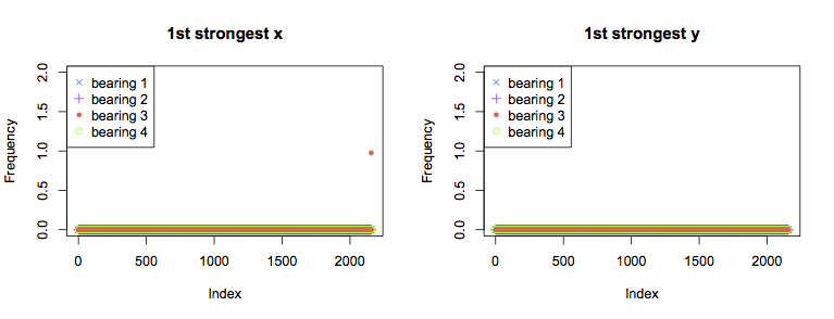
Above are graphs for the strongest component for each bearing over time. In both the x and y axes for all bearings, the strongest FFT component is the dc term for the majority of the experiment. The single exception is the final measurement from bearing 3 in the x axis, for which the strongest component is at 1Hz. This is not very informative overall, as it would be better to see a trend towards failure rather than the failure itself.
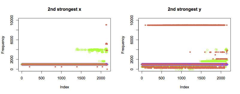
The second strongest components show the pattern I had hoped for. Bearings 1 and 2 show the same frequency throughout. Bearing 4 (green) changes frequency about two thirds of the way through the test, in both axes. A third frequency starts to occur closer to the point of failure.
Bearing 2 (orange) displays a very different pattern of behaviour in the y axis from all other bearings, and shows occasional anomalies in the x axis. It is hard to tell purely from the data if this indicates a weak bearing or installation right from the start of the test. Regardless, the y axis starts to show unusual frequencies from just past halfway through the test, which become more constant as failure approaches. The x axis also shows new frequencies right before the failure occurs.
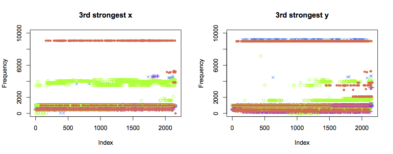
The patterns of the third strongest components are not as clear. Despite remaining healthy, bearings 1 and 2 also show variation in frequency towards the end of the test. Further data analysis is likely to be able to pull more information out of thse traces than simply eyeballing the plots.
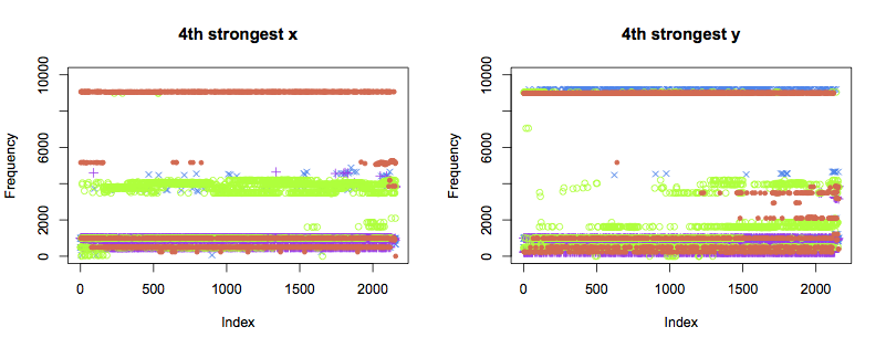
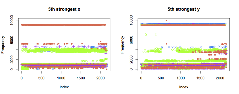
The 4th and 5th strongest components display similar patterns to the 3rd:
Next steps
Plotting graphs and scanning for patterns is a key part of data science. However, this bearing vibration data set is too large to do this for all of the data. With a few hours of work, I reduced it to a more manageable size using some simple feature extraction techniques: frequency analysis, and extraction of key components.
Looking at plots of these extracted features confirms that they usefully describe the bearing vibration data. The second strongest FFT component of both the x and y axes displays the pattern I was expecting, which is good evidence for being a high-information feature.
Most importantly, I reduced the dataset from over 44 million individual datapoints per bearing to 21,560. This is significantly easier to visualise and process on a desktop computer, and therefore makes the next stages much easier.
To take this further, the next step would be to model deterioration of the bearings, trying to detect or predict bearing faults. There are many different techniques that could be used for this. Technique selection generally requires a bit of trial and error.
Once the diagnosis or prediction technique is selected, it’s probable that I’ll have to generate new features from the original data. However, the same general approach to feature extraction applies: visualise the data, calculate a possible feature, and verify that it works.